Showing posts with label Graphic Design. Show all posts

Jul 27, 2015

Graffiti Youth Ministry Booklet

One of the best parts of my job is the variety that I am able to work with.
Because I began as a graphic designer a few years ago before branching off into wedding stationery "full time" (lots of attention, but still workin' two jobs), I still receive a lot of clients who are looking for other genres and styles of work.

Introducing: Graffiti Youth Ministry booklet (or "GYM" for short—aren't we witty?)

Derek was looking for something that would give an urban vibe while still remaining clean and welcoming—he was pretty set on colors and general content but other than that he was fairly flexible.  Despite his positive attitude, "inner-city" and "friendly" do not typically go hand in hand, so we had a real challenge ahead of us.

He also wanted a logo for the group, and I was more than willing to play around with a little bit of easy typography for the cover!

We continued the style that he chose throughout the book: brick wall texture in the background, graffiti style heading, crisp and clean design.


There were a few pages where we had to deviate from the main layout for the sake of legibility and functionality. But keeping in the color scheme and subtle background allowed the look to remain consistant without being the same on every single page.

Overall, the project was a fun challenge for me that resulted in a fun product!  And the client was pretty excited about the finished design, which always makes the experience more rewarding for me. 
Happy clients = happy Katrina!


Jul 20, 2015

Cross Country Camp T-shirt Design 2015

I don't always share my corporate-like, graphic design work on this little blog.  And the main reason being that is isn't usually as exciting.  I mean, design can be nice or well done without being blog worthy, ya know?  Business clients don't always like it if you go crazy creative and have fun on their medical brochure or mailer... so sometimes it's just there, and you only notice if something is wrong with it! haha


Anyway, here's a new design that I made for one of my favorite clients: the Hubbard ;)  He coaches the high school track and cross country team, and each year I have the fun challenge of coming up with a new design for their team shirts.

I decided to go a little more rustic and give the nod to vintage signs/stamps that I've seen popping up everywhere (and by "everywhere", I mean "Pinterest").  Because this is not my typical style, it took a few tweaks and adjustments before we were satisfied with the result, but now we are excited to hand them out to the team and sport them around the campground!


Would you like to see more of this style of work on here occasionally? Client designs (not the "boring" ones, of course haha!), personal designs, and maybe even a few tutorials?
 Let me know!

May 18, 2015

Color Blocking


Here's an old piece that I did in college for a school event.  I loved playing around with the colors and the positive and negative space, but my professors said that it looked more like sausage links, haha!
Needless to say, this piece isn't pulled out very often, but after I was looking through a few old files, I found it and decided to share :)


 photo Email.gif  photo bloglovin.gif  photo Instagram.gif  photo Etsy.gif  photo facebook.gif  photo twitter_coral_zps378d584f.png
All Items are (c) Katrina Crouch. Do not use without permission

May 3, 2015

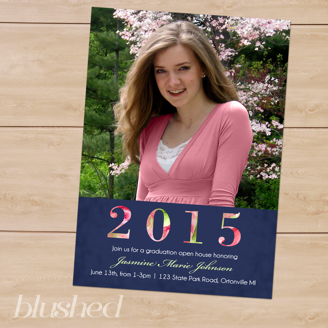
Graduation Open House: Floral Cutout


Another Graduation Announcement has made it's way into the shop this week! I love the floral accent within the text of the year.  It adds texture and just that little bit of something-something extra.

To see this design, and others, check out the shop!


 photo Email.gif  photo bloglovin.gif  photo Instagram.gif  photo Etsy.gif  photo facebook.gif  photo twitter_coral_zps378d584f.png
All Items are (c) Katrina Crouch. Do not use without permission

Apr 17, 2015

Flash Back: SAU Art Logo


A couple of years ago, I was asked to redesign the logo and website of the Spring Arbor University Art Department.  I really enjoyed the typographic play and the positive/negative space that is at work in this piece and was thrilled when the profs liked it enough to use it as the "official" logo for the department.
After designing a logo that all of the professors could like/agree on (not an easy task, I assure you), I collected images and prepared to create the website.  Despite the fact that I was able to finish it before graduation, the communication/pr group at SAU were not as excited about it as we were and decided not to publish it.  They did, however, take the photos that I collected and use them in the current site, so I feel a little more justified in that (especially because a number of my own pieces in the collection)

And the website was on display at my senior art show in 2012, so that was a bonus in and of itself I suppose.

 photo Email.gif  photo bloglovin.gif  photo Instagram.gif  photo Etsy.gif  photo facebook.gif  photo twitter_coral_zps378d584f.png
All Items are (c) Katrina Crouch. Do not use without permission

Mar 30, 2015

April Desktop Calendar (2015)


Happy (almost) April!
March came in like a lion, showed a few lamb-like characteristics and seems to want to go out just as lion-like as ever! Ah well, the month was filled with the usual highs and lows, and was overall a considerably pleasant month.  I hope you were blessed.

To celebrate leaving the official months of all things cold and windy (you'll notice that I said "official"), I have not one, not two but THREE desktop background designs for you to choose from.

I know, I know, I should get a medal or something!

Or, I could just get over myself and not eat ice cream right before I blog...

But weird moods like to write blog posts, so we're just gonna roll with it.

As always, these designs will be under the "Free Downloads" tab for the duration of the month (and will be posted below for just about the rest of our lives), and I have also included a bonus for the celebration of Holy Week and Easter!  So head on over, pick your favorite and let me know which one you choose!


 photo Email.gif  photo bloglovin.gif  photo Instagram.gif  photo Etsy.gif  photo facebook.gif  photo twitter_coral_zps378d584f.png
All Items are (c) Katrina Crouch. Do not use without permission


Mar 16, 2015

Blooming Graphic Design — National Flower Show 2015

A few years ago, I had the opportunity to participate in the National Flower Show with the Williamson Free School of Mechanical Trades.  I had a blast—a challenging project, but with great team and rewarding results (the best kind of projects!).  So I was elated when they asked me to partner with them again this year.

Each year has a theme, and this year it was the "Oscars"!  While my role was not quite as exciting as in previous years, it was sill fun to work on the graphics and see some photos of the finished look (being 3 states away, I was unable to venture out and see it in person).

The main illustrative element that I needed to create was the flower that mimicked the statue (seen below).

Photo Credit: Williamson Free School of Mechanical Trades

After that, the rest was comparatively easy, though the company logos that obviously did not fit into the general theme were a bit annoying at times...  especially for the brochure.
Kinda hard to keep it strictly classy when there are large logos all over the place, but we made it work :)

Brochure—Inside flap, back and cover
Brochure—inside

There were also a series of smaller informative posters (or "panels"), the first of which can be found "in action" at the top of this post, and below are two more of the designs:


Simple, informative design.  We wanted to mimic the brochure and so I pulled out the film strip that was decided upon previously and allowed the "captured" images to emphasize and demonstrate the "Gold Medal Plants" in each category.
These panels were placed within Gold frames that further mimicked the Oscar's theme


 photo Email.gif  photo bloglovin.gif  photo Instagram.gif  photo Etsy.gif  photo facebook.gif  photo twitter_coral_zps378d584f.png
All Items are (c) Katrina Crouch. Do not use without permission


Mar 7, 2015

Logo: TIMESPAN


Above is a recent logo design that I did for a trivia app.

The product is not out on the market yet—in fact, the only reason that I'm sharing it with you now is because the name was changed and we are going in an entirely different direction with the logo and visuals.  But don't worry, the real thing will be out soon and I'll be sure to let you know!
Over
and over
and over again! ;)

Anywho—what do you think?  Have you ever finished a project and then decided to toss it and go in a different direction?

 photo Email.gif  photo bloglovin.gif  photo Instagram.gif  photo Etsy.gif  photo facebook.gif  photo twitter_coral_zps378d584f.png
All Items are (c) Katrina Crouch. Do not use without permission

Blogger Template designed By The Sunday Studio.